OLIVER #1
Image Comics
Writer: Gary Whitta
Artist: Darick Robertson
Image Comics brings us a steam-punk inspired, post-apocalyptic science fiction, superhero reinterpretation of the classic Charles Dickens novel – Oliver Twist. That’s a lot of genres right there.
The two creators behind the project are screenwriter Gary Whitta and seasoned artist Darick Robertson. For those that aren’t familiar with comic book ‘lore’, Robertson is the co-creator and artist on some of the most critically acclaimed series of the last 20-or-so years. He’s famous for Transmetropolitan, The Boys, and HAPPY!, while also providing interior work for both Marvel and DC comics. When it comes to comic books, he’s kind of a big deal. On the other hand, we have Gary Whitta, a relatively unknown name in this part of the entertainment industry. But he isn’t just a random person that decided to write a book (not that there’s anything wrong with that). He was the screenwriter for The Book of Eli and co-wrote the story for Rogue One: A Star Wars Story. Suffice to say, he’s a professional.

So what does a steam-punk inspired, post-apocalyptic science fiction, superhero reinterpretation of Oliver Twist – with an added Shakespearian flair – look like?
The TL;DR answer: Like a darn good book.
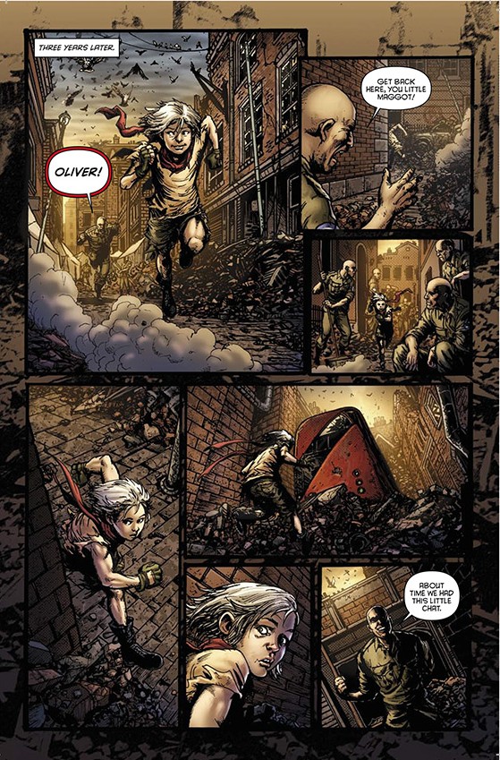
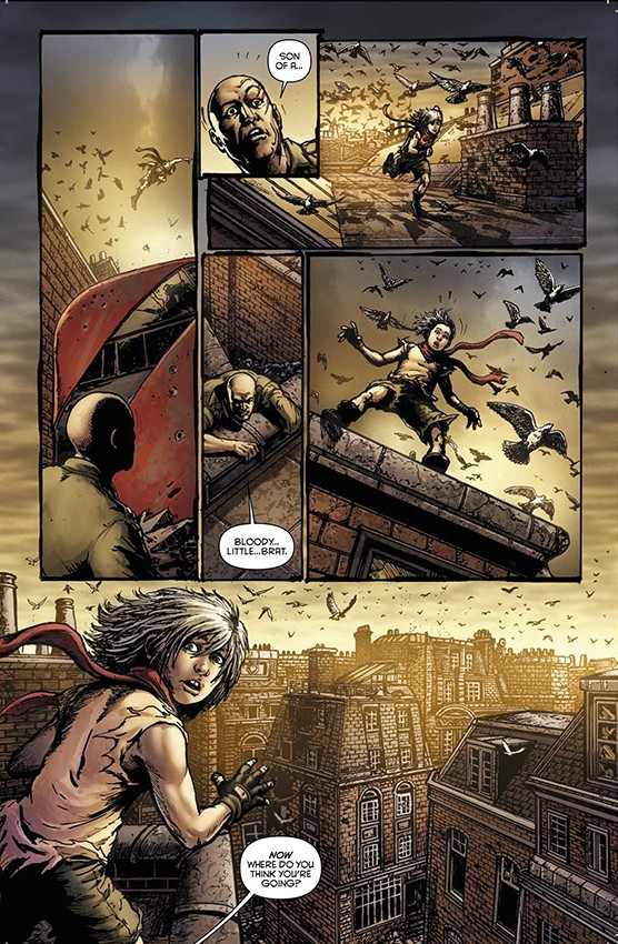
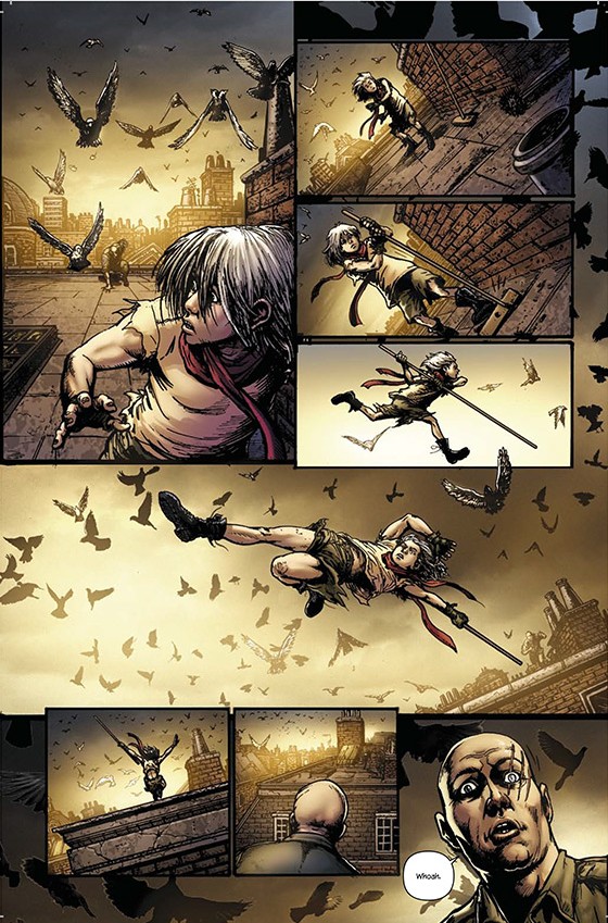
Right off the bat – the art is great. Darick Robertson has crafted his style over many years, across many different books, and it shows. The art has some real texture to it and does a lot of heavy lifting for Whitta on the world-building department. Robertson also swears that he was really dedicated to capturing London accurately and even flew there a couple of times to get some personal reference shots. Now, I’ve never personally been to London, but I’ve watched a lot of movies and shows that take place there and I can tell you that the city presented in the book looks amazing.

The coloring might not seem like anything special at first, seeing that a sepia overtone dominates the entirety of the book. It’s your standard post-apocalypse flair and it has become a bit tiresome over the years, but it still adds a great level of depth to the art itself. There are a few moments when there’s just a hint of other colors and it makes those scenes pop. There’s this one particular panel of Oliver running from a guy, with a hint of blue in the sky. It’s beautiful.
A lot of times, reinterpretations just end up being whole new stories and characters that only share the names with their ‘inspirations’. Fortunately, it doesn’t seem to be the case with this particular take. Gary Whitta has said that OLIVER was actually the first screenplay that he pitched in Hollywood. While no studio picked it up, the script did end up putting Whitta on the map. This was almost 20 years ago, but Whitta continued to work on it over the years. Darick got on the project early on, but it took them almost 15 years to finally get it going.
All that time, Whitta has obviously carefully crafted and developed his idea, utilizing some of the basic concepts Dickens tackled in his novel. The novel served as a critique of the growing poverty of the times, while also showing the lives of people who have served their purpose just to be ignored and pushed to the fringes of society. All of those themes are present in the series and prove that this is, in fact, a true reinterpretation.

While I do enjoy quality world-building, it always ends up slowing the pace of a story. That usually isn’t a problem, but it might be for a first issue. The world Whitta and Robertson are crafting has me interested, but the book itself is a tad slow. This might end up alienating some readers as there’s no real plot setup. The cliffhanger does raise some valid questions, but not enough. First issues are usually epic and bombastic, their main purpose being to hook readers so they come back for more. Here’s hoping that the world-building, the art, and the clues throughout the book are incentives enough to bring people back for the coming months.
Despite the slow-burn approach the team is taking to their presentation, it’s obvious that they know what they’re doing. The art is textured and beautiful, and the world presented is interesting and exciting. I’m looking forward to exploring this new version of London while also hanging out with all the different clones of Herr Starr.
OLIVER #1
So what does a steam-punk inspired, post-apocalyptic science fiction, superhero reinterpretation of Oliver Twist - with an added Shakespearian flair - look like? It looks like a darn good book.
-
Story
-
Characters
-
Art


